Problema
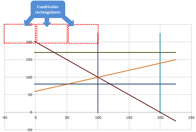
Cuando creamos un gráfico, Excel no respeta el mismo ratio para el eje de abscisas y de ordenadas. Por ello si dibujamos las líneas de división se genera una cuadrículas rectangular.
Solución

Para crear una cuadrícula y que conserve el mismo ratio empleamos el siguiente código escrito por Jon Peltier.
- Copiamos el siguiente código en un módulo
- Presionamos ALt+F8 y nos aparecerán dos opciones:
Option Explicit

Sub MakePlotGridSquareOfActiveChart()
    MakePlotGridSquare ActiveChart
End Sub

Sub MakePlotGridSquareOfAllCharts()
    Dim myChartObject As ChartObject
    For Each myChartObject In ActiveSheet.ChartObjects
        MakePlotGridSquare myChartObject.Chart
    Next
End Sub

Sub MakePlotGridSquare(myChart As Chart, Optional bEquiTic As Boolean = False)

    Dim plotInHt As Integer, plotInWd As Integer
    Dim Ymax As Double, Ymin As Double, Ydel As Double
    Dim Xmax As Double, Xmin As Double, Xdel As Double
    Dim Ypix As Double, Xpix As Double

    With myChart
        ' get plot size
        With .PlotArea
            plotInHt = .InsideHeight
            plotInWd = .InsideWidth
        End With

        Do
            ' Get axis scale parameters and lock scales
            With .Axes(xlValue)
                Ymax = .MaximumScale
                Ymin = .MinimumScale
                Ydel = .MajorUnit
                .MaximumScaleIsAuto = False
                .MinimumScaleIsAuto = False
                .MajorUnitIsAuto = False
            End With
            With .Axes(xlCategory)
                Xmax = .MaximumScale
                Xmin = .MinimumScale
                Xdel = .MajorUnit
                .MaximumScaleIsAuto = False
                .MinimumScaleIsAuto = False
                .MajorUnitIsAuto = False
            End With
            If bEquiTic Then
                ' Set tick spacings to same value
                Xdel = WorksheetFunction.Max(Xdel, Ydel)
                Ydel = Xdel
                .Axes(xlCategory).MajorUnit = Xdel
                .Axes(xlValue).MajorUnit = Ydel
            End If

            ' Pixels per grid
            Ypix = plotInHt * Ydel / (Ymax - Ymin)
            Xpix = plotInWd * Xdel / (Xmax - Xmin)

            ' Keep plot size as is, adjust max scales
            If Xpix > Ypix Then
                .Axes(xlCategory).MaximumScale = plotInWd * Xdel / Ypix + Xmin
            Else
                .Axes(xlValue).MaximumScale = plotInHt * Ydel / Xpix + Ymin
            End If

            ' Repeat if "something" else changed to distort chart axes
            ' Don't repeat if we're within 1%
        Loop While Abs(Log(Xpix / Ypix)) > 0.01

    End With

End Sub
MakePlotGridSquareOfActiveChart: Modificará el gráfico activo.
MakePlotGridSquareOfAllCharts: Modificará todos los gráficos de la hoja.

Referencias
 Nube de datos
Muchas gracias, muy útil, resuelve un inconveniente de forma rápida, y evita hacerlo manualmente.
ResponderEliminarGracias por el comentario. Ese es precisamente el propósito de esta entrada y, en general, de todo el blog. Un saludo.
EliminarExcelente, muy buen aporte
ResponderEliminar